Wednesday 24 April 2013

The Art of Typography - online course


I'm very excited to say I'll be running an online course called The Art of Typography in partnership with Skillshare. The course will be perfect for designers, illustrators, artists and people who regularly make presentations. I'll show you how to use typography most effectively for communication. We will look at how different typefaces can give off different messages. I'll show you how world famous brands use typography within their visual identity to enhance their brand message. And we will have lots of fun creating your own typefaces - digitally, hand drawn and maybe even with food! 

Your new skills and knowledge will then be put to practise in your project to illustrate a favourite quote or lyric. There will be lots of opportunity for feedback and encouragement from myself and fellow students. 

I've had a passion for typography since my design degree and then working with a great typographer in my first job. I'm really looking forward to sharing my knowledge and love for the subject. Sound like your type of course?! the course kicks off on the 14th June 2013... if you use the discount code ALPHA that will get you 15% off the $20 enrolment fee. 

If you have any questions about the course please don't hesitate to get in touch... 

Tuesday 23 April 2013

Smart Creative Women - intro video


I got chatting to Monica Lee of Smart Creative Women through the comments on one of her videos... a few weeks later Monica has a brand new intro to her videos! Using her fabulous paintings we made Dunkin the dog come alive and join in for a coffee, chat and a little dance. 

As an avid listener to the Smart Creative Women videos I was really pleased to work on the intro. Monica was a dream to work with. You can check out the animation in Monica's inspiring interview with Kathy Davis here.

I really enjoy working with fellow creatives, especially if we have different skills and talents. If you work on your own a lot I would highly recommend putting yourself out there a bit. I used to work in a busy creative studio surrounded by talented people and I have to say I miss it... as much as I love working from home! There are pros and cons, I'm going to write a post about that soon so stayed tuned.

But for now, please do check out the video and interview.

Wednesday 17 April 2013

Branding - Scarlet Knight Hairdressing

In my third and final branding spotlight of the day I'd like to share with you the branding my husband and I worked on for Scarlet Knight Hairdressing. 


John and Charlotte from Scarlet Knight had done a lot of research and they were very clear in their preferred colour palette and typeface - Le Havre. It's a great typeface so I was really pleased we had a good started point. So the question was whether to go down the route of just using the typeface for a logotype or whether to incorporate a logo mark. I began sketching away, getting some of the more obvious ideas out the way (a shield for Knight was one of them!). I always think this is a good approach... even if you know you probably won't use it, it's good to get it on paper so you can clear you head for others thoughts - like writing to do lists! 

As I was sketching away drawing hair brushes and scissors I realised there was something clever we could do with the S and the K. I also liked the idea of using the circle to create the negative space and cut out feel to the visual identity. It pulls it together and keeps it neat. 


My husband, Simon Brown, then went on to design the website and developed the visual branding across the pages. 

Hope you've enjoyed my little branding spotlight today! Three very different projects for very different clients... but all really enjoyable to work on and with (hopefully) successful results!

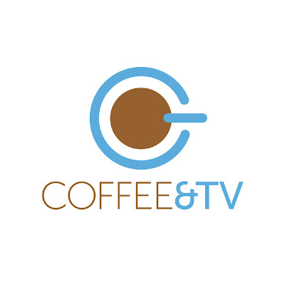
Branding - Coffee & TV

Carrying on with the branding posts, here's the logo I designed for visual effects and post production company Coffee & TV. Having worked in Soho for over 10 years I fell in love with this name as soon as Chris Chard (Producer at Coffee & TV) told me. There's a huge coffee culture around Soho mixed with all the TV production houses the name was perfect. 

So when I was asked to look at their branding I jumped at the chance! I usually begin a branding project by sketching out a few ideas and see what comes naturally. I started playing around with the on symbol for electrical appliances and suddenly had that lightbulb moment. 


I love logos that don't have to work too hard and just say what they need to say in the simplest way. Hopefully this is one of them!

Branding - Mums on the Run

I want to share with you a branding project I've been working on lately for Mums on the Run UK. When Leanne got in touch via twitter I was so pleased. As mum to a young toddler I know how hard it is to keep fit with a little one... whether it's finding the time to exercise or resisting eating chocolate every time they cry!! Mums on the Run is a community of females who all offer advice and encouragement - check out that Facebook page here.


Leanne had a clear idea that she wanted to incorporate the Union Flag within the branding. It was important the logo looked sporty without being overly feminine. The middle circle acts almost like a running medal that can be used individually if needs be.